Ask any eCommerce experience optimizer, and they’ll tell you, perfecting the product pages should always be the ultimate aim. For these are the pages where visitors spend the maximum amount of time learning about the product they wish to purchase and ultimately walk on the path to converting into paying customers.
But, creating high-converting product display pages is an art not everyone understands. From the correct placement of images to writing catchy call-to-actions and adding apt product descriptions, there’s a lot to focus on. To get you started, here are seven best practices for building high-performing, high-converting product display pages. Let’s dive in!
1. High-quality images work wonders.
It’s no hidden fact that a picture is worth a thousand words. So, encash on it!
In an age where shoppers rapidly skim through search results, one of the easiest ways to grab their attention is by adding large, crisp, and high-resolution images on your product pages. Great product photography has the prowess to build a level of trust in the eyes of the buyers, especially when it comes to the eCommerce market.
Since a shopper cannot see the product in person, give them the ability to virtually inspect the product at all levels and make the purchase. The more the pictures (from every angle), the more are the chances of persuasion and hence, conversions.
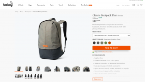
Let’s take Bellroy, for example. The eCommerce platform has added a series of high-quality images on its product pages that help shoppers inspect the product from every possible angle. Besides this, Bellroy has also added contextual content next to images in the second and third fold of the page that adds more authenticity to the product.
2. Leverage reciprocity
As wisely quoted by the famous psychologist Robert Cialdini, “the role of reciprocity governs people today.” Meaning, humans tend to repay when given a gift. Applying the same rule in the world of eCommerce means when a seller offers an additional freebie or a gift with the original product, buyers tend to reciprocate the seller’s effort by making a purchase.
3. Highlight customer reviews
Gone are the days when spending significant portions of your marketing budget on social promotions encouraged sales. Today, all you need to do is ask customers to add authentic and genuine reviews on your product pages. The more the number of reviews on your product pages, the higher are the chances of a shopper buying it
The statistics below testify our claim:
Approximately 95% of online shoppers today read reviews before making a purchase.
72% of online buyers do not take any buying actions until they’ve read product reviews.
The chances of purchase increase by 15% when online shoppers read verified reviews.
Word of mouth can influence 20% to 50% of all purchasing decisions.
Given the power of reviews, it’s best to feature them on your product display pages prominently. They help build trust and assure potential buyers that they’re making the right buying decision.
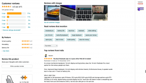
Customer reviews for Apple MacBook Pro posted on Amazon are an excellent example to quote here.
4. Remove the clutter
As stated above, shoppers today skim through product pages. They’re only interested in reading key product information. Give them long paras of textual information, and they’ll abandon your page right away.
So, why take the risk? Remove all unnecessary textual information from your page or convert them into biteable content. Minimal product page content enables shoppers to quickly grasp the most important information and instantly make the purchase.
Retaking Bellroy’s example, the eCommerce platform has carefully included only the most essential and engaging information on its product pages.
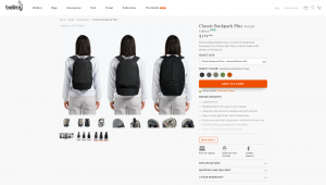
Gathering learnings from the bag company, here are a few decluttering tips:
5. Write compelling product descriptions
As a rule of thumb, any shopper landing on your product page(s) will instantly glance through two prominent page elements – the product image(s) and its description. While images help shoppers analyze and inspect the product on a macro level, their descriptions act as a catalyst, educating shoppers on a micro-level – offering enough information that compels/motivates the shopper to purchase.
Here are a few tips for writing product descriptions that win conversions:
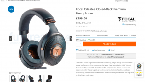
The image given above portrays an excellent example of a compelling product description. It talks about the product’s “elegant design,” “remarkable sound performance,” and “outstanding tonal balance”. Considering these headphones over other average headphones available in the market reflects in its product description language.
6. Make mobile a priority
Over the last half-decade, mobile commerce has grown at an exponential rate. It’s projected that mobile commerce sales will reach $3.56 trillion in 2021, almost 22.3% more than 2020. So, focus your energies on optimizing your product pages for mobile devices today!
As a seller, ensure that your product pages properly load on mobile screens, are easy to navigate, and enable shoppers to access the right information in one go.
Flipkart is an excellent example to quote here.

7. Play into the shopper’s FOMO
FOMO, short for “fear of missing out,” is originally a social media term, but it also finds its meaning in the eCommerce world. Highlighting the scarcity of products on your platform can create a sense of anxiety in buyers’ minds, persuading them to make a purchase right away. The fear of missing out on a great opportunity is where you can encash and increase sales as an eCommerce business.
To play into this FOMO, here are some clever ways to highlight scarcity on your product pages:
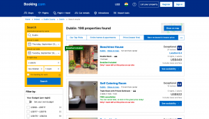
Booking.com is a classic example to quote here. The hotel booking site indicates that there’s only 1 room left at the listed price on specific properties. Making a booking right away is the best decision you can make. Creating such FOMO helps play with the minds of the users and increases the chances of conversions.
Conclusion
Besides these, there are many more strategies that you can implement to perfect your product display pages and make them more conversion-centric. The trick is to understand the psychology of your buyers and use the information accordingly to craft your product pages. The more buyer-friendly your pages, the more are the chances of conversions.
https://slot-88.my.canva.site/
https://slot-demo-live.my.canva.site/
https://data.harvestportal.org/uploads/user/2023-03-31-113345.774509slot-pakai-pulsa.html
https://data.harvestportal.org/uploads/user/2023-04-21-091903.762589bandar-sbobet.html
https://data.harvestportal.org/uploads/user/2023-04-30-081757.215482anti-sedot-wc.html
http://www.scholink.org/ojs/files/journals/45/articles/18198/submission/original/18198-163541-1-SM.html
https://eurolatinstudies.com/files/journals/1/articles/322/submission/322-1-632-1-2-20230430.html
https://data.basarnas.go.id/uploads/user/2023-05-04-043138.533351anti-sedot-wc.html
https://data.basarnas.go.id/uploads/user/2023-05-04-043624.956286bandar-sbobet.html
https://data.basarnas.go.id/uploads/user/2023-05-04-044608.665038index.html
https://data.basarnas.go.id/uploads/user/2023-05-04-045833.068561index.html
https://judi-bola-online88.powerappsportals.com/
https://slot-gacor-freebet.powerappsportals.com/
http://via-pulsa.inhukab.go.id/
https://tracerstudy.stkipmodernngawi.ac.id/slot-kamboja/
http://satudata.palukota.go.id/uploads/user/2023-05-24-104228.247893slot-thailand-gacor.html
http://satudata.palukota.go.id/uploads/user/2023-05-24-104435.143917slot-kamboja-gacor.html
https://www.smasalhidayahmangli.sch.id/views/slot-kamboja/
http://slot-kamboja.stkipmodernngawi.ac.id/
https://alumni.oti.co.id/wp-content/index.html
https://ejournal.perpusnas.go.id/files/journals/1/articles/4633/submission/original/4633-9313-1-SM.html
https://ejournal.perpusnas.go.id/files/journals/2/articles/4634/submission/original/4634-9315-1-SM.html
https://lika.co.id/slot-gacor/
http://103.108.190.91/uploads/user/2023-05-26-090124.121821rtp-slot-gacor.html
http://120.48.56.155/uploads/user/2023-05-26-090622.967520rtp-slot-gacor.html
http://13.42.35.76/uploads/user/2023-05-26-091620.680989rtp-slot-gacor.html
http://kilimodata.developlocal.org/uploads/user/2023-05-26-092022.534466rtp-slot-gacor.html
http://kilimodata.org/uploads/user/2023-05-26-092022.534466rtp-slot-gacor.html
https://dadosabertos.tce.go.gov.br/fa_IR/uploads/user/2023-05-26-092746.610395rtp-slot-gacor.html
Comments are closed