In 2020, e-commerce retail sales amounted to 4.28 trillion US dollars, and in 2022, it is expected to reach a whopping 5.4 trillion US dollars. The trend of online shopping will only grow as we advance. Therefore, it comes as no surprise that you must focus on your ecommerce website design.
If you want to thrive in the ever-so-competitive ecommerce industry, your website should reflect the true spirit of your business.
The site should represent who you are and what you do. If you can nail the first impression, your visitors are more likely to turn into your customers.
We’re here to help you explore some of the best ecommerce storefront design tips you can use to offer an unmatched user experience (UX). Without further ado, let’s discuss the best practices.

Your website attracts plenty of traffic every day, and you should optimize your ecommerce website design to track these visitors. If you wish to make the most of this data, you need to follow the right metrics and leverage the information for marketing and sales.
Here are the most crucial metrics when it comes to your online store:
Using platforms like FarziCom is a great way of leveraging user data to enhance the experience. FarziCom comes equipped with a robust CMS panel, making it perfect for your ecommerce storefront design.
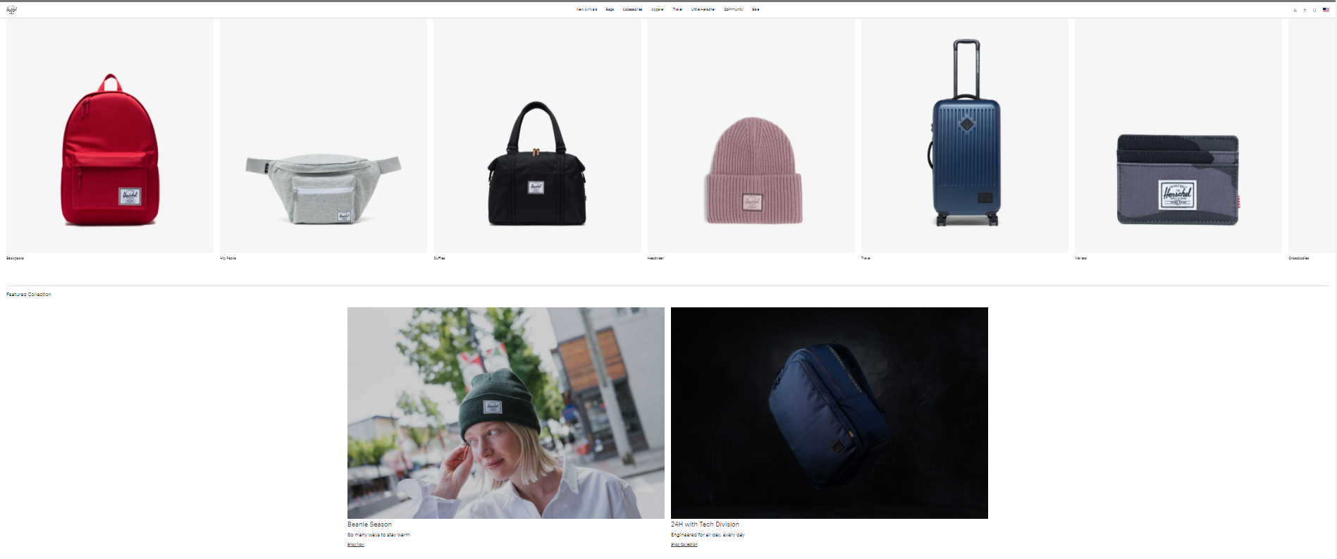
If you wish to make browsing through your ecommerce site a pleasant and effective experience, you need to focus on the product layout. One of the most vital aspects of ecommerce storefront design is uncluttered product arrangement.
Incorporating a grid layout in an ecommerce website makes it visually attractive. One of the best ecommerce website examples, in this case, is the Herschel.com ecommerce store. Its product pages feature rows of only three to four products, giving it a neat and appealing look.

The organized web design encourages visitors to focus solely on their products. FarziCom offers countless customization options so that you can pick a layout that works best for you.
In this day and age, most ecommerce website designs are optimized such that they’re accessible for sections of society. While ensuring accessibility, may or may not be a legal requirement in your region, you should still hold your website to the standards to promote inclusivity.
An excellent example of this practice is 100percentpure.com. Their website design is such that even people with situational or functional limitations can use it comfortably. Their efforts to put the customer above everything else are reflected in their website design.

If you’re wondering how to make your web design more accessible, here are a few of the things you should consider:
With FarziCom, the team focuses on creating a website design that is suited for people with all sorts of needs.
Branding is a vital part of ecommerce UX design. Any user would be more inclined towards shopping at a vibrant store with an engaging copy rather than an ecommerce storefront that only contains limited information and lacks a personal touch.
Effective branding is about more than just simply writing the product description. Your ecommerce site should clearly define your brand. It should show what makes your brand different from its competitors.
 With FarziCom, you get to work with copywriters and designers that specialize in developing an effective and consistent brand image. They can help you with the landing pages, product category pages, and a lot of other branding requirements for your website design.
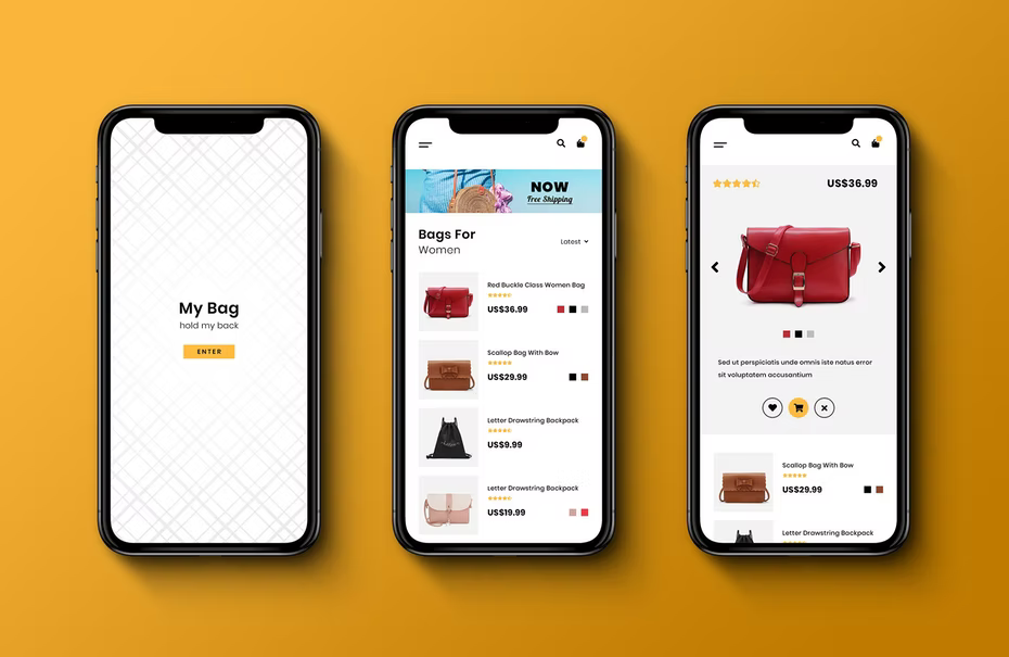
Investing in a high-quality desktop website is not worth it if it doesn’t work well on mobile devices. Moreover, about 79% of all smartphone users made an online purchase using their mobile devices, within the last 6 months itself. Your target audience is spending more and more time on mobile phones. They are now used to shopping with their handheld devices.
If you want to ensure that your site runs smoothly on all devices, you should focus on the following:
The ASOS app is a good example of an intuitive layout. It serves as a great reference whether you look at its desktop website or mobile version.
You can collaborate with tools like FarziCom, to help you build an ecommerce storefront that works seamlessly on both desktop and mobile.
Your ecommerce storefront design should not just focus on the product but give a clear image of your brand.
If you want to make a stunning and practical ecommerce UX design for your customers, you should abide by the requirements discussed above. In case you do not have your own website design specialists, you can always collaborate with services, such as FarziCom, to help you get by.
So, what are you waiting for? Optimise the website already!
Comments are closed