Cart is a very prime real estate on any eCommerce website, more so in the Indian context because 90-95% of the user base in India is a mobile user. Usually we see two possible variations of the cart – Cart Slider or a Full Page Cart. There are certain merits to choosing one over other but that’s a story for another Thursday today we are focussing on how to make the most out of the limited space that you have. The approach that we are going to follow is that we will start by lisiting what all a customer needs on the cart and then sharing a few designs of good vs bad cart based on our experience. We will try to add conversion numbers based on our past experience of running tests. So let’s get started.
Essentials of any Cart
- Items present in Cart (Image, Name, Price), Add/Remove/Quantity button
- Totals
- Free Shipping
- Discount & Savings Data
- CTA
Cart Items
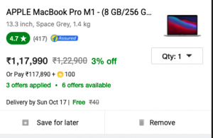
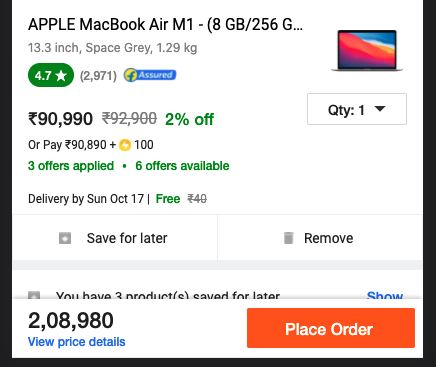
Always show Cart items with image, discounted price, Discount Percentage. Following are good examples of how to show cart items. The right one is from Flipkart, it has a lot of relevant elements which may not be applicable to all D2C brands but the general theme is to show all the factors that can influence decision making like – Ratings, Discount, Trust Badge (Flipkart Assured), Delivery Date etc.

Totals Section
No need to have multiple level of breakdown, if the space is less just show whats relevant and add a collapsible for detailed breakdown. All user cases about is, how much it’s going to cost him or her.
Make sure to highlight the additional charges separately like shipping and Cash On delivery, these charges may or may not be part of totals break down but should be very clearly visible.
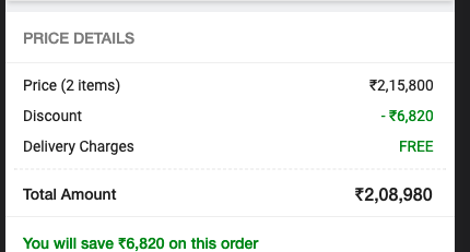
Following image is from Flipkart, they have a View Price details link that scrolls down the cart to price summary section which is otherwise below the fold
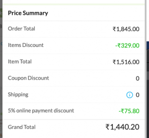
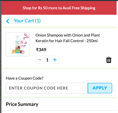
This Price summary from Mamaearth is better put inside a collapsible and it’s worth AB testing whether or not this version is performing better. In our experience this is a bad design and wastage of prime real estate along with increased cognitive load on user.
Free Shipping And COD
Highlight these in bright colors and Use the word Free instead of “0” that gives a sense of happiness to users. A happy user converts more. If you have a certain threshold for Free Shipping use progress bar to let the user know how much more to add for Free shipping, Utilise Top bar on the cart to let the user know about eligibility.
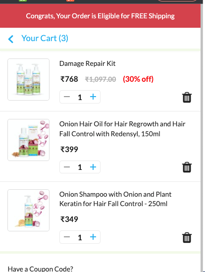
Shared below is example from Mamaearth they have used Red color on top bar to highlight the section but using two colors Red and Green would have been better. Green denotes Success to using that when the threshold crosses for free shipping would have played well in terms of color psychology.
Discount Or Offer Box
In the Indian context discounts rule the market, no one wants to buy at list price so instinctively they go and search for coupons and no matter what you do they will find your product or your competitors product on offer on websites like Grabon, Free Ka maal, etc.
This is a calculated risk that you need to take to avoid people moving away from checkout after you have spent so much money on marketing to bring them to website. Always show a currently running offer to avoid loosing users from Cart. Inspiration can be taken from Swiggy or Zomato.
Some websites like Oyo, Lenskart, etc try to inflate savings by clubbing All the offers including cashback and Free shipping. This can confuse early users as a new brand we should detest from changing user behavior and expectations. For mature brands this might work.
At Farziengineer we always keep the Cashback and Discounts separate and don’t add the shipping in savings. Most important of all – DON’T SKIP ON SAVINGS STRIP
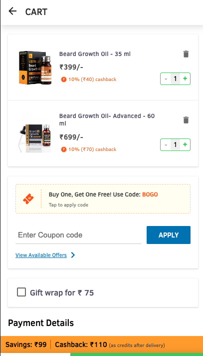
This cart from Ustara has it all, they have their prime offer in a box, all available offers in collapsible, they even have the discount box available right on cart, this is a very good move.
Savings strip is also well placed
Call To Action
Each page should have one single Call to action , in this case it should be Proceed TO Checkout or Place Order, choose whatever works for you. Things not to do with CTA –
- Don’t let it Overlap with Chatbot or Gift Plugin
- Have more than 1 CTA, Recently People have been opting for multiple checkout options but that is not recommended


