Even though unique, fancy designs may seem attractive, they result in a poor user experience. Incorporate a conventional eCommerce navigation design to ensure your viewers spend more time on your website and reach the conversion stage.
According to Amazon Web Services, about 88% of viewers are unlikely to return to the site post poor user experience.
Provide a seamless experience to your customers with these 5 proven eCommerce navigation best practices.
1. Create a Sales Funnel to Boost Customer Rate Optimization (CRO)
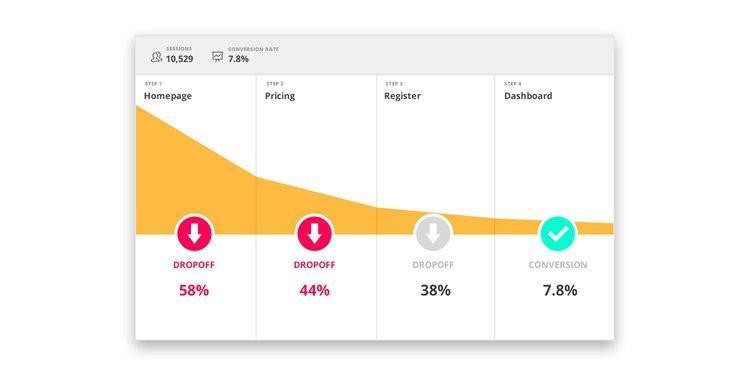
The sales funnel is a model that directs customers to take the next step towards conversion. However, most websites do not give enough importance to the sales funnel. Creating and analyzing the funnel can help you visualize the areas with high drop rates and streamline eCommerce navigation.
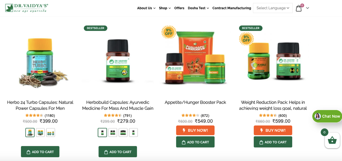
When the team at FarziEngineer analyzed Dr. Vaidya’s website, they realized the massive drop in the customer path. The team created a dedicated funnel with clear buttons like Search Bar, Add to Cart, Checkout, and Review to improve the CRO. The change resulted in a 10-15% boost in the CRO.
2. Ensure Rapid Loading Time to Reduce Bounce Rate
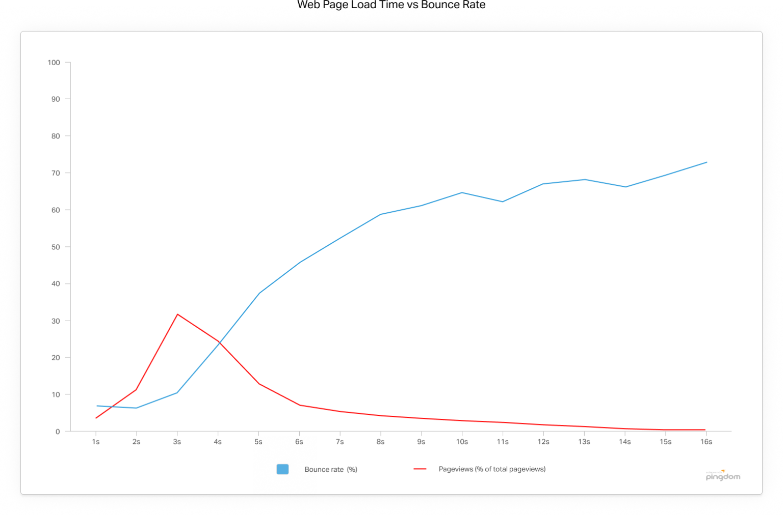
According to a survey conducted by Pingdom, a page that loads within 2 seconds has a bounce rate of about 9%. However, the bounce rate of a page loading in over 3 seconds is a whopping 38%. Therefore, low loading time is quintessential to providing a smooth eCommerce navigation UX.
3. Add the Same Subcategory Under Multiple Parent Categories
Why would you add the same category under multiple parent categories? It clearly enhances the product visibility leading to higher chances of sales.
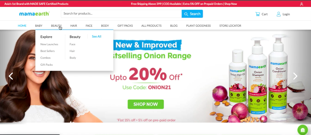
An excellent example of this is MamaEarth. The brand’s new website launched by FarziEngineer has subcategories like Hair, Face, and Body, which are also individual parent categories. The same applies to Gift Packs present both as subcategories and parent categories.
4. A Catchy Category Just for Best Sellers
When you have visitors who are not familiar with your products, show them what others are buying. By displaying the best seller products, you convert a visitor into a potential lead.
This eCommerce navigation practice helps build trust in your brand, directing the user towards the next step of the sales funnel.
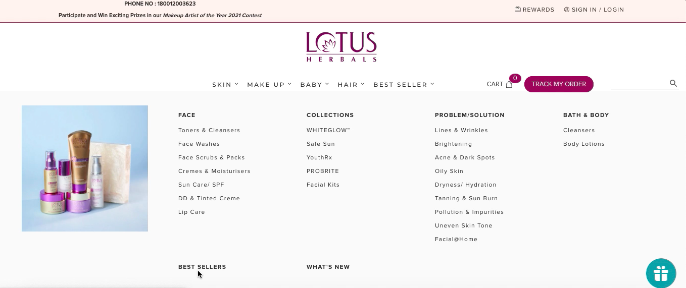
Lotus Herbals’ website had a single page, confusing the new visitors instead of leading them through a path. FarziEngineer’s team organized the brand’s website into multiple products and best seller categories, resulting in higher conversion rates.
5. Bigger Search Bar
Your website visitor can easily get lost amidst the mounts of texts providing product descriptions, features, and services.
Bigger, crisp, and visually pleasing buttons will help the users perform their desired action without wasting time.
Besides, the first few eCommerce navigation steps can significantly influence a user’s decision.
MamaEarth has a big fat search bar right at the top of the homepage, letting users look for the product instantly.
Such navigation practices work for users’ awareness of the products they want, be it through a relevant keyword or the product name.
Wrap Up
While web designing is complex, the secret to seamless eCommerce navigation is using minimal design familiar to users.
Even if you are planning to revamp your website, implement simplistic styles like a dropdown menu and visible parent categories.
Your website viewers may not be aware of your web structure. It’s your obligation to create a crystal clear path for them to abide by.
Follow these e-commerce navigation best practices and watch your conversion rates proliferate!


